The Logo

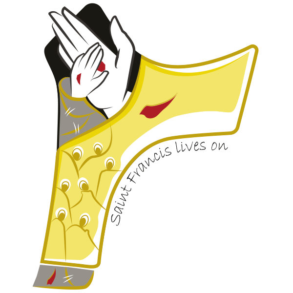
The logo takes the shape of the Tau, a symbol dear to Francis, because it reminds us of the inexorable, daily passage from death to Life and the way in which we have been redeemed. Therefore, there are two contrasting colors: black and yellow, death and the light of the Risen One. On the right, the crucified hand of Christ is larger and overcomes every boundary of evil, because death has been definitively defeated. Painful gashes of red represent the wounds of His burning love for every man and woman. The signs of the resurrection are now a reason for deep consolation for Francis, so much so that he can place his own hand, visibly pierced, next to that of Christ, without any fear. And this makes it possible that even death may deserve the title of sister, because only in and with it is fulfilled the courageous and trusting act of total surrender of oneself to the good Father.
Thus, on the day of the definitive Easter, the little saint finally finds himself entirely clothed in glory; and if once the dark gray penitential habit, with its thousand patches, was a symbol of poverty, now and for eternity, the new garment woven with golden threads bears imprinted all the richness of the brothers, the sisters, and of creation.
